
Sprout Spend
Personal project mentored by Tanner Panetta
Sprout Spend is a financial app concept aimed to support young adults in the very beginning of their financial journey.
Problem & Solution
The main problem is that when young adults get their first job and start making money, bad habits can form immediately. When you don’t have to pay for living expenses yet, most money goes to fun expenses, which can get out of control at a young age.
The solution is to help young adults want to learn about money by providing a super simple, no frills app, where they don’t have to question if they’re making the right decisions. Understanding money and budgeting as soon as possible with guidance from parents, and motivation to learn, helps get young adults into good habits right off the bat. This sets them up for life.
Brainstorming & Research
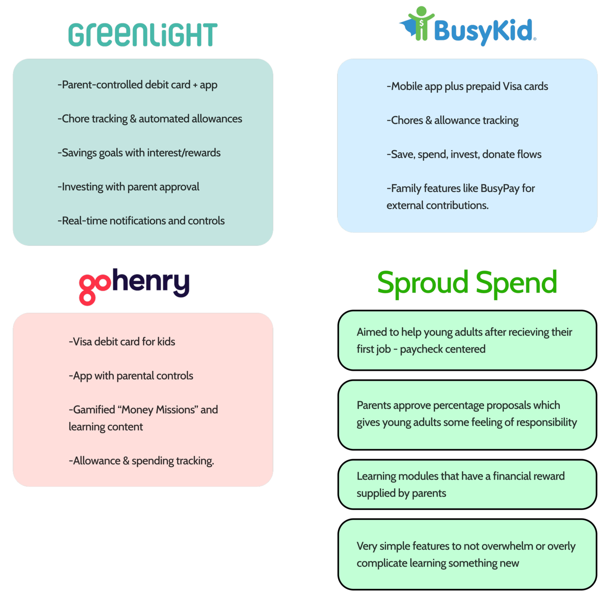
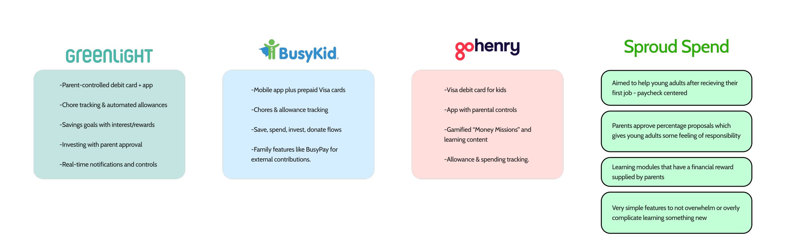
First, I conducted a competitive analysis to see what the market is doing in terms of financial guidance/apps for kids. Below is a chart of what each company does as a main function, compared to how I was going to improve, or change this. This analysis really helped me figure out which direction Sprout Spend needed to head in to support young user, as well as parents.
Defining User Types
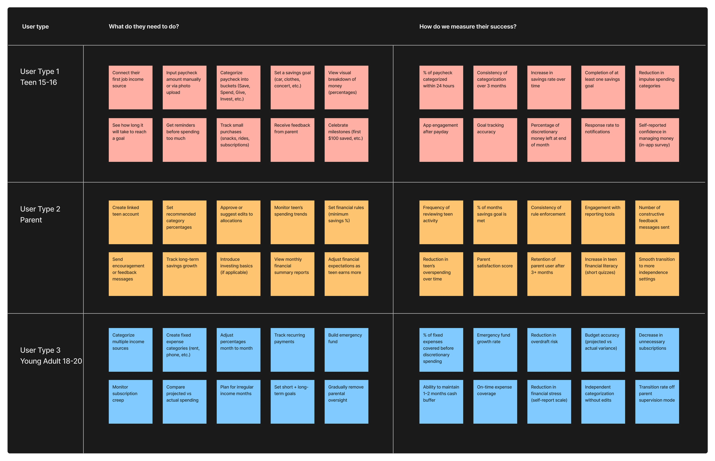
Next, I defined the 3 main user types, and psychoanalyzed what each user type’s needs are. We need to know what they need to be able to do in the application, and how we can measure the success of that action. Who are they? What age? From where? Why would they be on this app in the first place? How do we retain them as a user? How can we support them in their financial journey? All of this information is crucial to inform the initial design process.
User Interviews
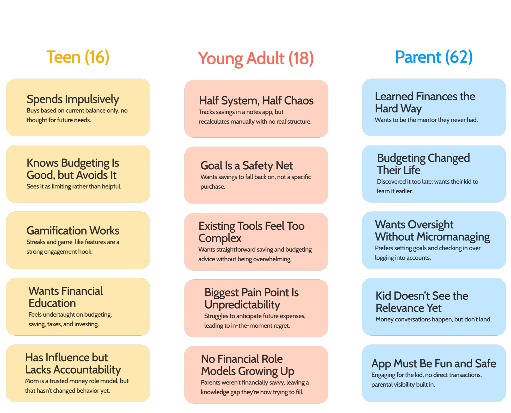
I conducted user interviews with each of my 3 user types. When creating the questions for the interview, I made sure they were unbiased and open questions that had follow ups to keep the conversation natural. By doing this, I was able to get really helpful raw information about each person’s experience. Here were the key takeaways for each user type…
Wireframing and Prototyping
These insights shaped the core features and visuals for the app. My guiding principle was simplicity, especially for users new to budgeting, since a lower barrier to entry makes it easier to build the habit before it feels overwhelming. At the end of the day, the goal is to give young users the confidence to be able to budget successfully, and learn about finances. Any extra fluff is unnecessary, and overwhelming.The key flows I focused on were onboarding, assigning money to budget categories after payday, and categorizing transactions after spending. I also built in a way for users to learn important financial skills in bite-sized lessons, with parents able to attach financial rewards to completed goals to keep things motivating. Once the features were defined, I moved into wireframes and prototyped three user flows that best differentiate this app from competitors and give test users a clear sense of what makes it distinct.
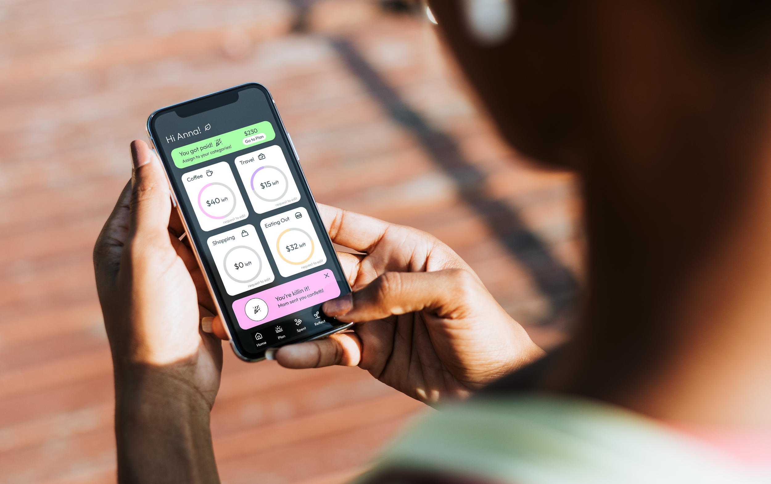
Final Screens
The Final Screens aimed to be simple, intuitive, and non threatening to a younger audience that is new to budgeting. The color choice and icon use was chosen to be fun and energetic for a younger audience. The font is very rounded to feel friendly to the user as well to ease them in to a new experience.
The onboarding gives users a sense of freedom, letting them choose their own categories and propose their own percentages, while still keeping a layer of guidance through the parent confirmation feature.
The home screen was designed with young users in mind, since many of them are used to opening their bank app and seeing one lump sum to spend. Rather than breaking from that habit entirely, I wanted the home screen to reflect it in a healthier way, surfacing the balances of their most important categories so they can get that same quick snapshot. The goal was to meet users where they already are and nudge them toward something better.
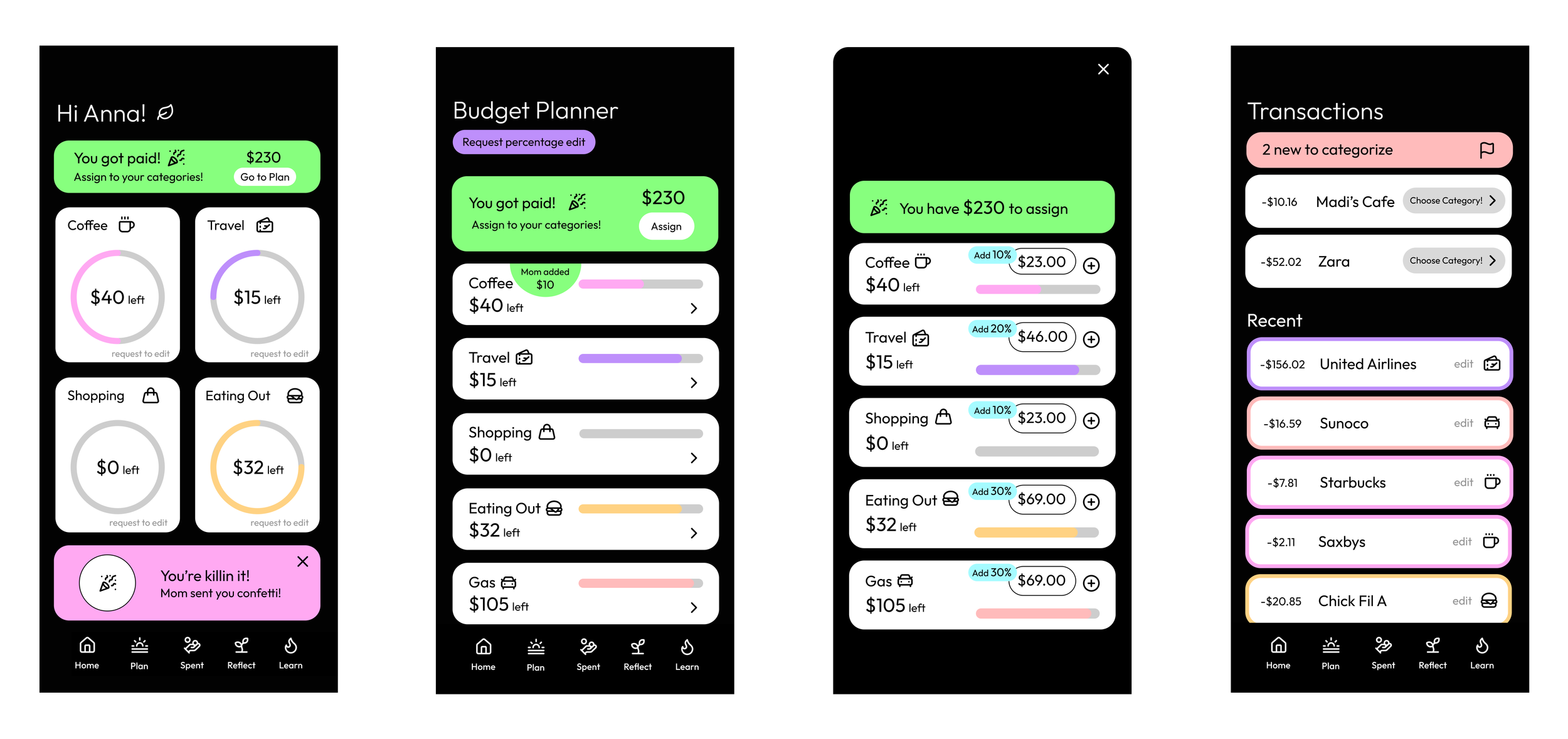
When a user gets paid, a notification appears on their home screen prompting them to assign the money to their categories. Each paycheck has a percentage tied to every budget category, approved by a parent, and the dollar amount is automatically calculated so the user can see exactly where their money is going. Even though the percentages are preset, having the user manually walk through the process each payday builds the habit of intentional allocation and gives them a sense of ownership over their budget. When a user spends money, their transactions link directly to their card and surface in the app to be sorted into the right categories. This flow reinforces the hands-on experience of spending, earning, and sticking with a budget.
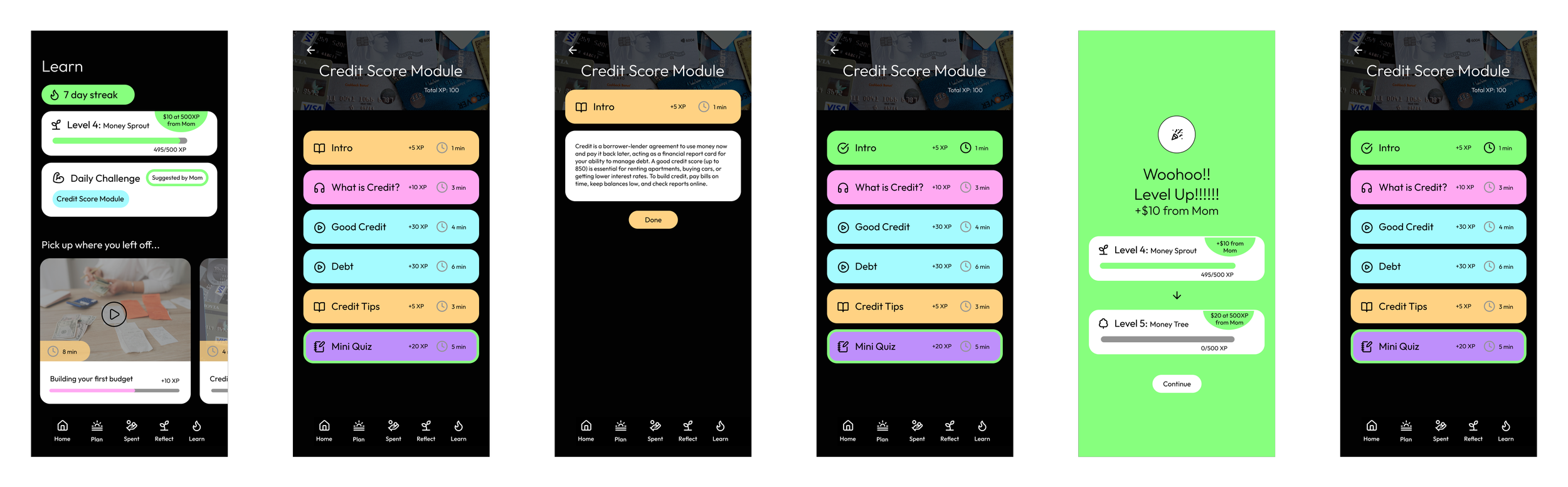
The learning feature lets users engage with financial lessons in a few different ways, keeping it from feeling repetitive. The motivation to maintain a streak and level up adds a gamified layer to it, and the rewards make it feel worth it. Parents can attach small money incentives to milestones, giving kids a real reason to keep coming back and keep leveling up.
Final Takeaways
To continue this project, there are a few directions I would want to push it in. First, I want to make sure the app supports users who do not have a parent or trusted adult to lean on for financial guidance. This could look like smarter app-suggested starting points, where the product analyzes spending habits over time and makes personalized recommendations on budget percentages and category splits for users who are more on their own.
I would also want to introduce three levels of control restrictions that loosen as a user grows in their financial independence. The idea is to ease them in with the flows above, and then gradually reduce how much they rely on parental approval for things like goal setting and budgeting, until they are largely managing it themselves.
Finally, I would want to build out resources for the parent side of the app too. This could include tips on how to bring up financial topics with their kids in a natural way, along with a clear roadmap of how the whole process unfolds, from the starting point with more guardrails, to the middle stage with growing independence, to the point where the user is almost fully on their own.