
Accessibility Improvement in the Septa App
This project started with a conversation with a stranger who shared their struggles navigating the new SEPTA app. Their feedback, combined with insights from additional users, helped me uncover where the issues where. Research revealed accessibility challenges, especially for non-native Philadelphians, and informed a solution that makes the app easier, faster, and more intuitive for all riders.

What’s the problem?
Riders often struggle to quickly find essential transit information in the SEPTA app. This especially impacts first-time or infrequent users and riders with accessibility needs. In real situations (being underground, in a rush, or multitasking), the app can feel overwhelming and slow to navigate.
My goal was to make the experience faster, clearer, and easier to use in real-world conditions.
Lets dive deeper…
To understand where users were getting stuck, I looked at the app from multiple perspectives:
Interviewed a current SEPTA user about their typical experience
Ran 2 informal usability tests on the existing app with users of different ages and backgrounds
Reviewed competitor transit apps (Google Maps, Amtrak)
Read public app reviews to identify repeated complaints and accessibility issues
This helped surface both usability problems and patterns across transit apps. I initially assumed the homepage was the biggest issue. While its complexity did frustrate users, further testing revealed that directions and train times caused even more confusion, which led me to shift the focus of the project.
What was found?
A few clear issues came up consistently:
Users struggle to find essential information fast
First-time riders have trouble identifying subway stations and knowing they’re in the right place
The app doesn’t clearly connect to what riders see in the physical subway environment
These gaps cause hesitation and stress, especially for new riders.
It’s time to design…
Based on these findings, I focused on a few main opportunities:
Highlight only essential information on the home screen
Reduce visual clutter and unnecessary choices
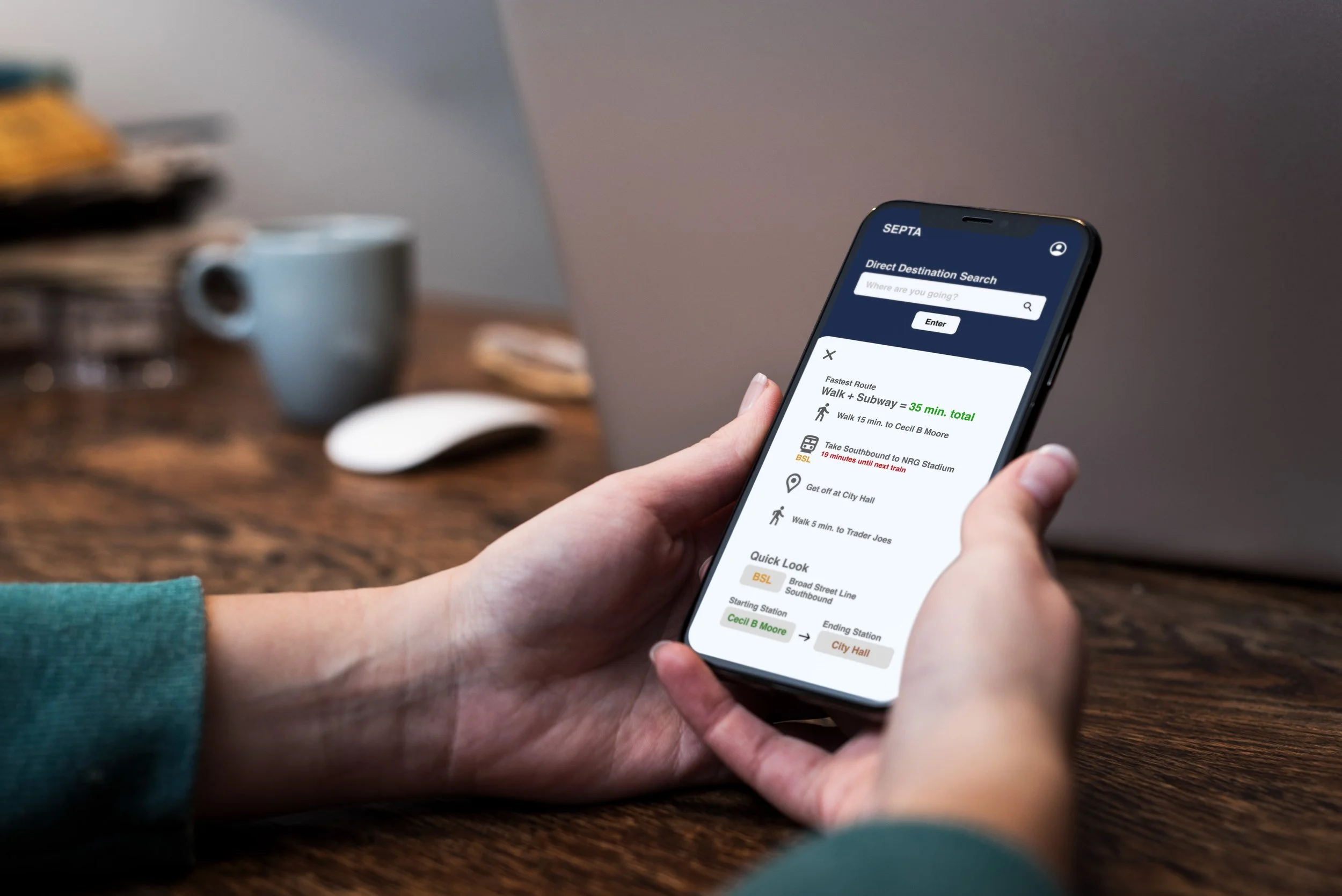
Use subway tile colors for fonts/buttons to create a clearer connection between digital navigation and physical stations
I translated these ideas into wireframes and an interactive prototype designed for users who are often on the move or in a rush.
The interface prioritizes:
Clear hierarchy and minimal content
Lower cognitive load
Accessibility and readability
Visual cues that connect stop names to station tile colors
Lets test this…
I tested the prototype with 4 users across different ages and experience levels.
Users completed tasks 40% faster compared to the original app
Participants reported feeling less confused and less stressed
First-time riders especially benefited from the added visual cues
I also noted areas for future improvement, including refining color contrast and improving label clarity.
What are the takeaways?

This project reinforced how important clarity and prioritization are in transit design. By focusing on only essential information and finding even small ways to tie the digital experience more closely to the physical environment, the app becomes easier to use for both first-time and regular riders.