Creative Director: Bonnie Kate Wolf
Icon Designer: Sydney Kuszyk
Icon Designer: Stephanie Du
Via The Iconography Company
Iconography System
Developed multiple keyline styles to test. This helped our team and Kalshi make an informed decision on which keyline direction to use throughout the system.
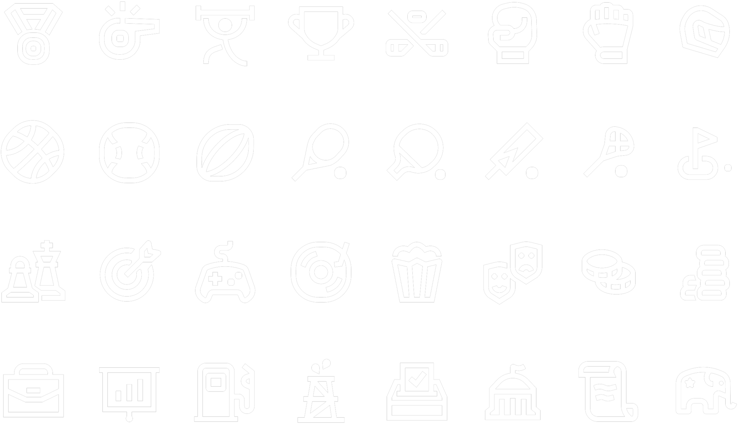
Followed the chosen keyline style to design over 180 icons and variants.
Pushed chosen metaphors in multiple directions and developed new metaphors. The creative director then made small adjustments to the final icons.
Keyline Development
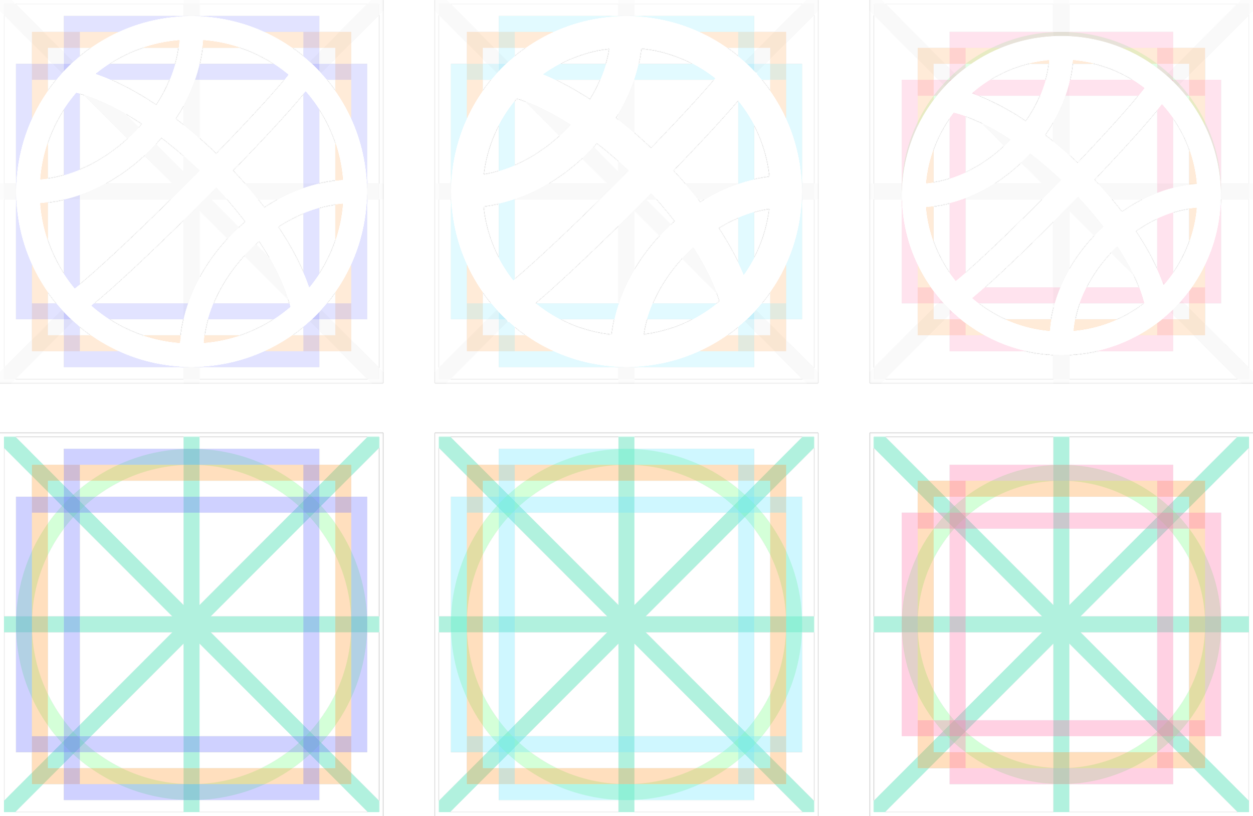
First, I developed 3 different keylines. Each was created to test different styles differentiated by stroke weight and padding.
This was to help Kalshi pick which style would look most cohesive in their product before developing the full system.
The Final Keylines
The keylines are showin in use for each prominent shape. A stroke weight and end cap was chosen based off of the original style directons I developed to pair cohesively with the Kalshi typeface.

Circle
Square
Horizontal
Rectangle
Vertical
Rectangle
Symbol Exploration
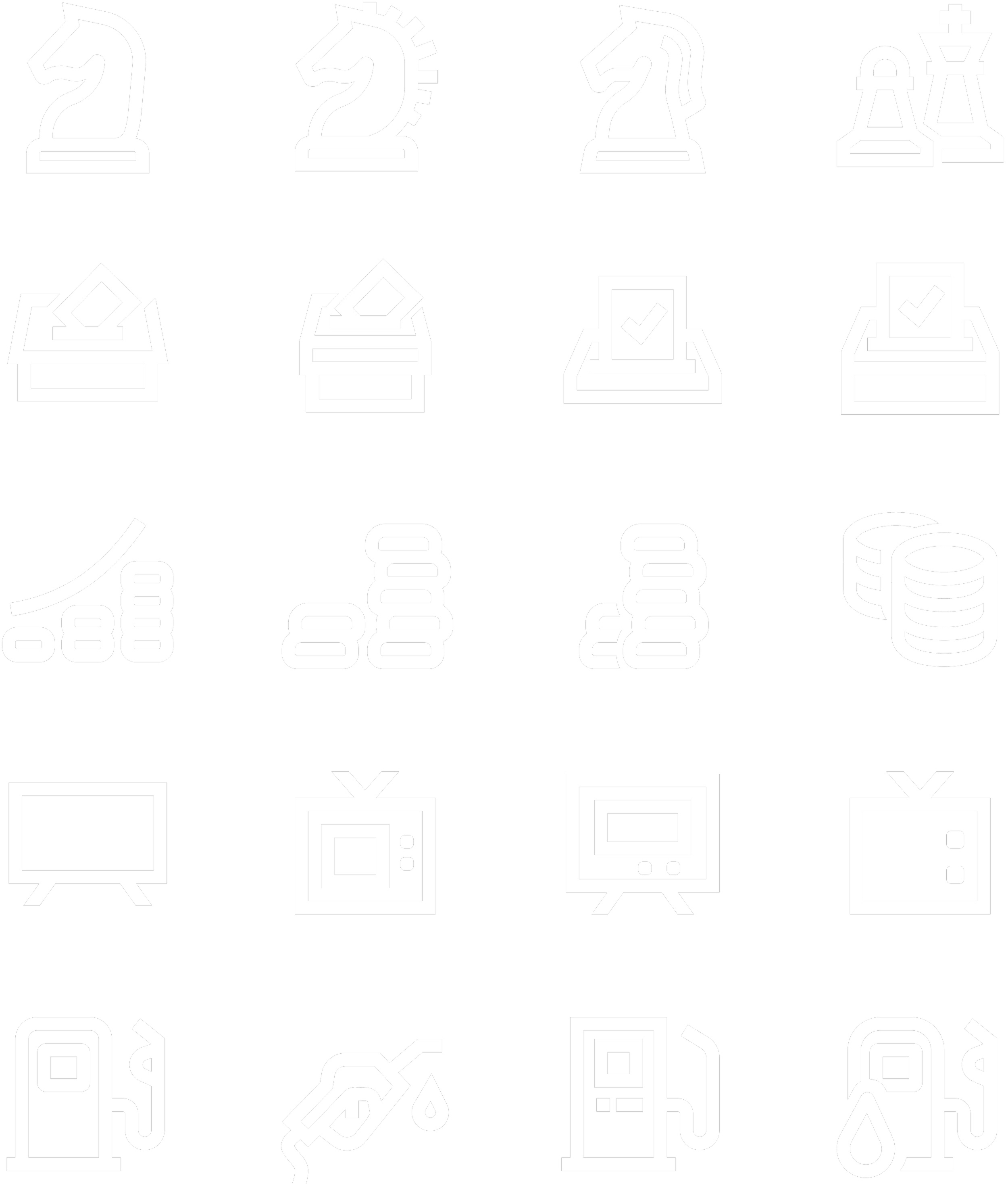
To find the best symbol, and the strongest execution of that symbol, I explored multiple metaphors and iterations of that icon.
Chess
Elections
Inflation
Television
Gas
Metaphor Development
I saw an opportunity to improve the metaphor in these certain icons. As a result, I explored many different ideas to present to Kalshi.

Sports
Music
Movies
Final Icon Contributions